For almost a year now, I’ve been working with the Pacific Grove Museum in Monterey Bay, California to help create awareness on the negative effects of local and global factors on health of the Carmel River — the largest source of drinking water in Monterey Bay county.
I built their website: https://thewatershedguardians.org/ to help visitors easily navigate to various research areas that the museum conducts in collaboration with CSU Monterey Bay. And I work closely with researchers to collect river data, such as Ph level, salinity, etc. and visualize them so that we can better understand how healthy the Carmel River is at various points on its path.
The Problem
Due to rainfall shortage, and over irrigation by nearby farmers, the Carmel riverbed is drying up and ocean water is filling up the bubbles underneath the riverbed. River rocks interact with the salt water to increase the basicity of the water (to higher Ph levels), which kills off certain types of fish in the river, leading to an unbalance in the river ecosystem: certain bacterias are growing as a result of not being eaten by steelhead trout (one of the fish species dying off as a result of high Ph levels in the river), and the water itself needs expensive purification to be fit for consumption.
Researchers are in the Monterey Bay area are teaming up to measure these changes in the river, through data points such as:
-
Ph
-
Alkalinity
-
Salinity
-
Flow velocity
-
Water temperature
-
Depth
Researchers have identified certain threshold for each parameter that corresponds with river health.
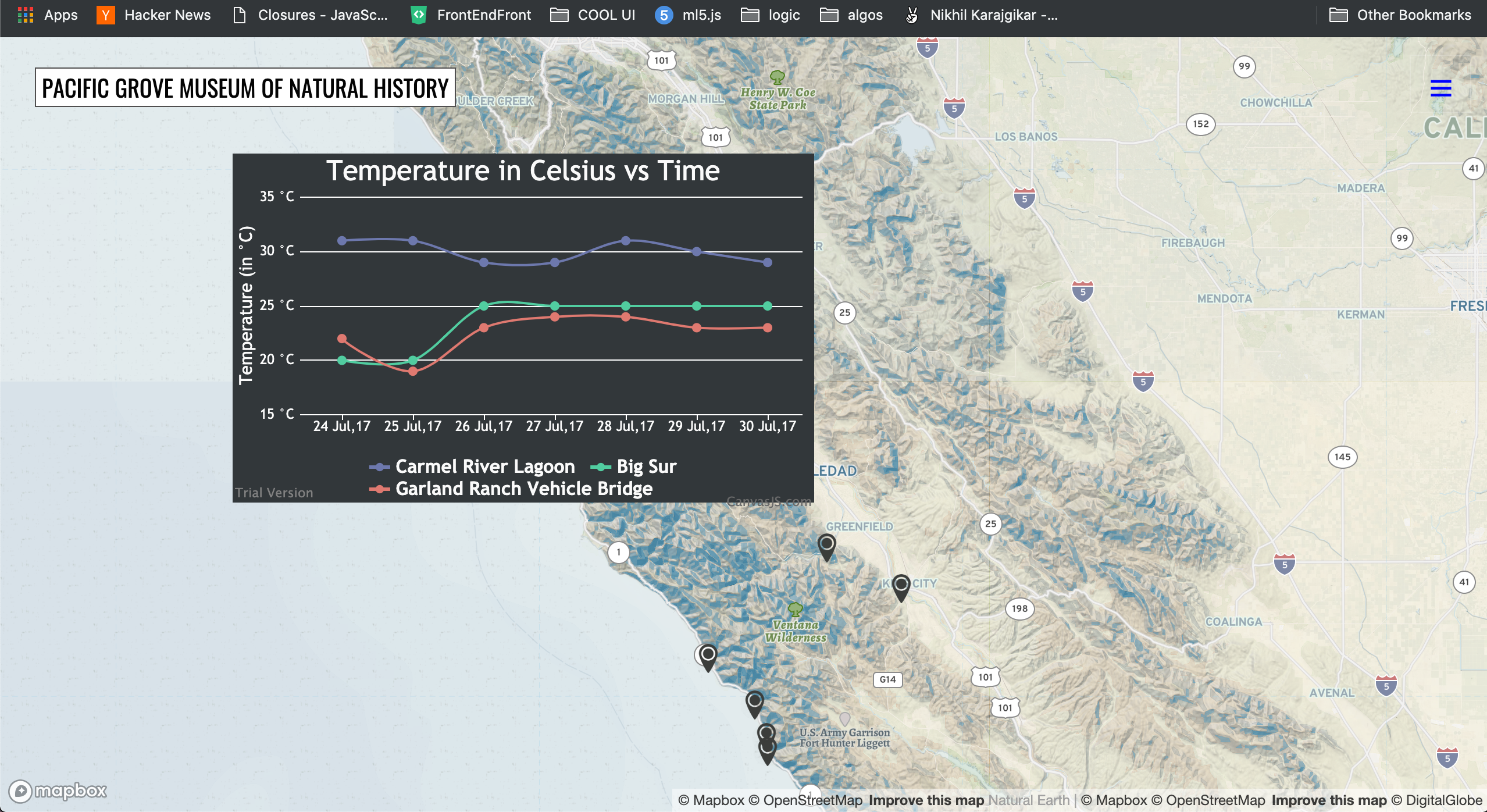
I was tasked with helping them visualize their data so that they can easily see dips or rises in parameters in the course of the river’s trajectory, compare values at different locations and to make it easier for them to discuss findings in presentations and meetings.
An example of a visualization;
A researcher
Future Directions
-
Open up this tool for anyone to play around with and learn from. We would like to have teachers at local high schools leverage this tool to teach watershed and environmental science.
-
Include in-depth explanations about what each parameter is for, how it impacts river health and communicate what the right range of values is — for that parameter.
-
Enable graphs for all locations (currently only available for Salinas and Big Sur areas).
-
Currently our website and research only identifies how the river is deteriorating, but doesn’t help site visitors understand what they can do to reverse this trend. We plan to do more research on local policies, regulations, etc. and help paint a picture for which policies to support in upcoming local government elections, to help protect and support the Carmel River. To summarize: we want to include actionable suggestions for our site visitors — who are mostly local residents in Monterey Bay county.
Technology
For the visualizations, I used:
-
Mapbox to render the map itself and annotate it with markers in the regions that we have data for.
-
D3.js to render the graph for each location. Users can choose which data points to render against time.
-
All data points are currently captured in Google sheets. The system parses Google Sheet data, converts to JSON and feeds into the D3 rendering engine.
Learnings
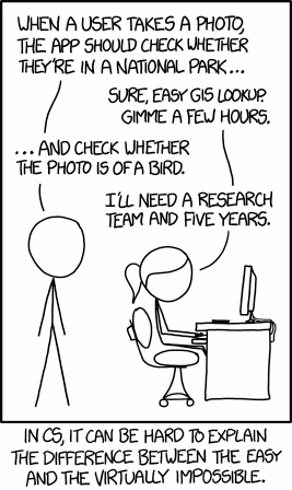
I’m the sole developer on the team, and the researchers I collaborated with weren’t very familiar with software development. I initially struggled to communicate timelines and explain why something that seems so easy from the outside actually takes longer to build than expected, and why other things that seem complicated takes less time than expected.
It reminded me of this xkcd:
I also had to refine my ability to communicate my software development at a high level — focusing more on outcomes rather than on the process itself.
Check our websites at: ThewatershedGuardians & *PacificGroveMuseumOfNaturalHistory*